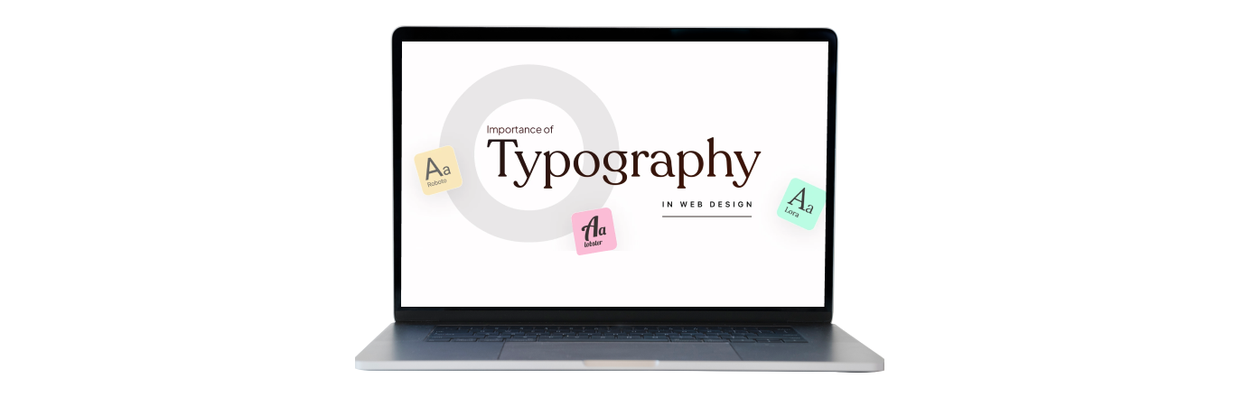
The Impact of Typography in Web Design: Selecting Fonts That Improve User Experience
By: AdminThe Impact of Typography in Web Design: Selecting Fonts That Improve User Experience
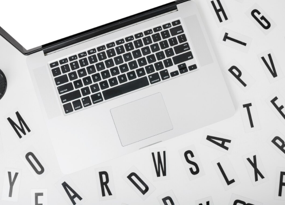
In the complex world of web design, typography stands out as a subtle yet potent power that tells stories, stirs emotions, and guides people through digital spaces that they feel a part of. At Code Calibre we are very much aware of the huge role typography plays in user experience and so we aimed to find answers as regards how to choose fonts that are attractive yet functional enough while facilitating easy access to any online material. Typography, a form of art using letters to convey a message without words is very effective. We love the art of typography at Code Calibre, using both creativity and accuracy because we know how much it influences reader’s perception when they are reading to understand what is being communicated effectively.
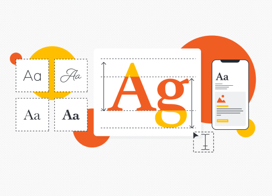
Every font selection is deliberate since one would want a combination that makes sense to viewers of his or her work even if there is no related story behind them; ranging from elegant-looking serif styles that suggest classiness to attention-grabbing bold sans-serif letters among others.
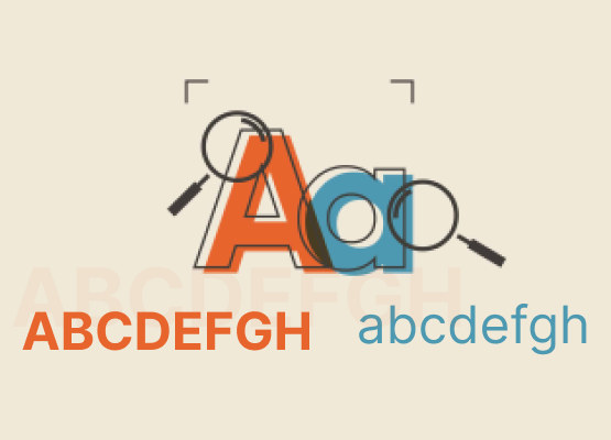
Improving Readability and Legibility: In digital spaces, readability and legibility are crucial. Poorly designed fonts can hamper comprehension and frustrate users, resulting in high bounce rates and lower engagement. Code Calibre rigorously picks fonts based on their legibility across a wide range of screen sizes and resolutions, ensuring that users can read seamlessly across devices. By emphasizing clarity, consistency, and hierarchy in typography, we enable visitors to easily traverse text and focus on what is genuinely important.
Typography sets the tone and establishes brand identification. At Code Calibre, we see typography as an effective tool for brand narrative and expression. Whether it’s a playful handwritten script for a whimsical brand or a sleek geometric font for a modern tech company, the font chosen reflects the brand’s personality, values, and objectives. We develop unified visual identities that leave an impression on users by strategically combining fonts and using typographic hierarchy.
Font pairing is a craft that involves finding the right balance between dissimilarities and uniformity. Instead of relying on artistic techniques, Font Joy relies on science to find fonts that will match each other well enough not to be too different while still not appearing identical to one another. This can be done by combining serifs with sans serifs or by varying weights together with contrasting stylistic features; the main aim for us is always about creating type compositions that are both dynamic looking due to their attractiveness thereby boosting the overall design environment of our client’s websites.
Code Calibre prioritizes accessibility and inclusivity while creating outstanding typography. We recognize that typography is critical in ensuring that websites are accessible to people of all abilities. We aim to make content intelligible and navigable for people with visual impairments or reading challenges by using typefaces with high contrast ratios, clear letterforms, and enough spacing. We strive to provide inviting and inclusive digital experiences for all by implementing inclusive typography standards.
Text in web design is vital as it designs visual space of digital visits on the internet that strongly influence one`s senses of web pages, reported Laura Franz’s article online. Code Calibre creates digital art that is captivating, inspirational and emotionally touches the clients by having a deep understanding of how different types of lettering influence reading as well as branding and the extent to which they can be accessed by those who require them. Please join us in our exploration! Let’s keep exploring, opening up endless possibilities for typography in web design.

 H-190, 2nd Floor, Sec. 63, Noida,
 +91 8505835822 (HR)


